Eclipse Auto Refinishing
30 years.
Overview
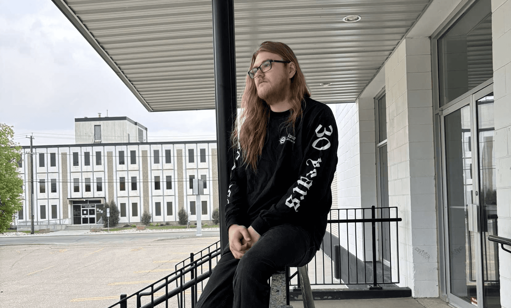
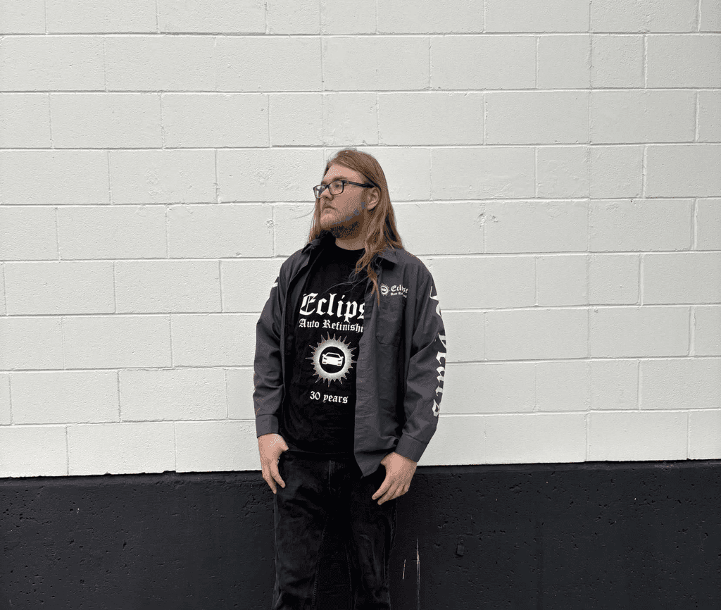
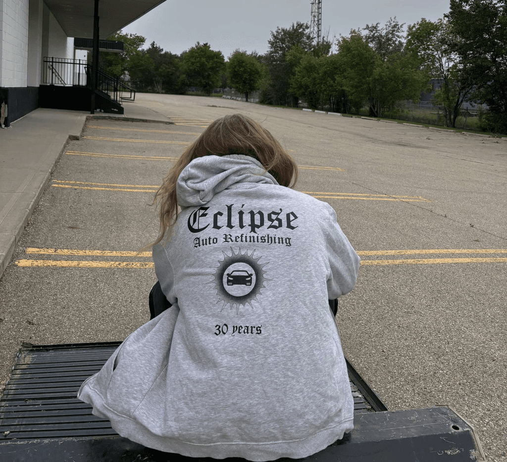
Eclipse Auto Refinishing reached out to me to design apparel celebrating their 30th year in business. Together, we landed on the idea of reimagining their logo for a special edition shirt, pairing it with the "Old English" typeface to give it a bold, classic presence.
Approach
For this project, I wanted to go deeper than just the surface. While my father co-owns the business, this design was about more than just family ties—it was about understanding the people behind Eclipse. I studied the shop's three core team members: who they are, what they build, and the pride they put into their work. Their results truly live up to their tagline: "Outshines the competition." I wanted this design to reflect that. Even with simple forms and a typeface that’s often seen as overused or dated, we created something that stands apart—something that, like Eclipse itself, shines brighter than the rest.
Jol.Design 2025
Edmonton, Canada